A boutique wealth manager's investment committee was reading four separately-maintained spreadsheets. We replaced them with a single refreshed dashboard.
The committee met weekly. Before each meeting, one analyst would update a performance workbook, another would refresh a market-conditions sheet, a third would re-build an allocation-vs-benchmark panel, and a fourth would assemble a PDF from the three. The process took most of Monday, and if an analyst was sick the meeting panel would be a day late. When the numbers were questioned, no single person could trace where a specific series had come from.
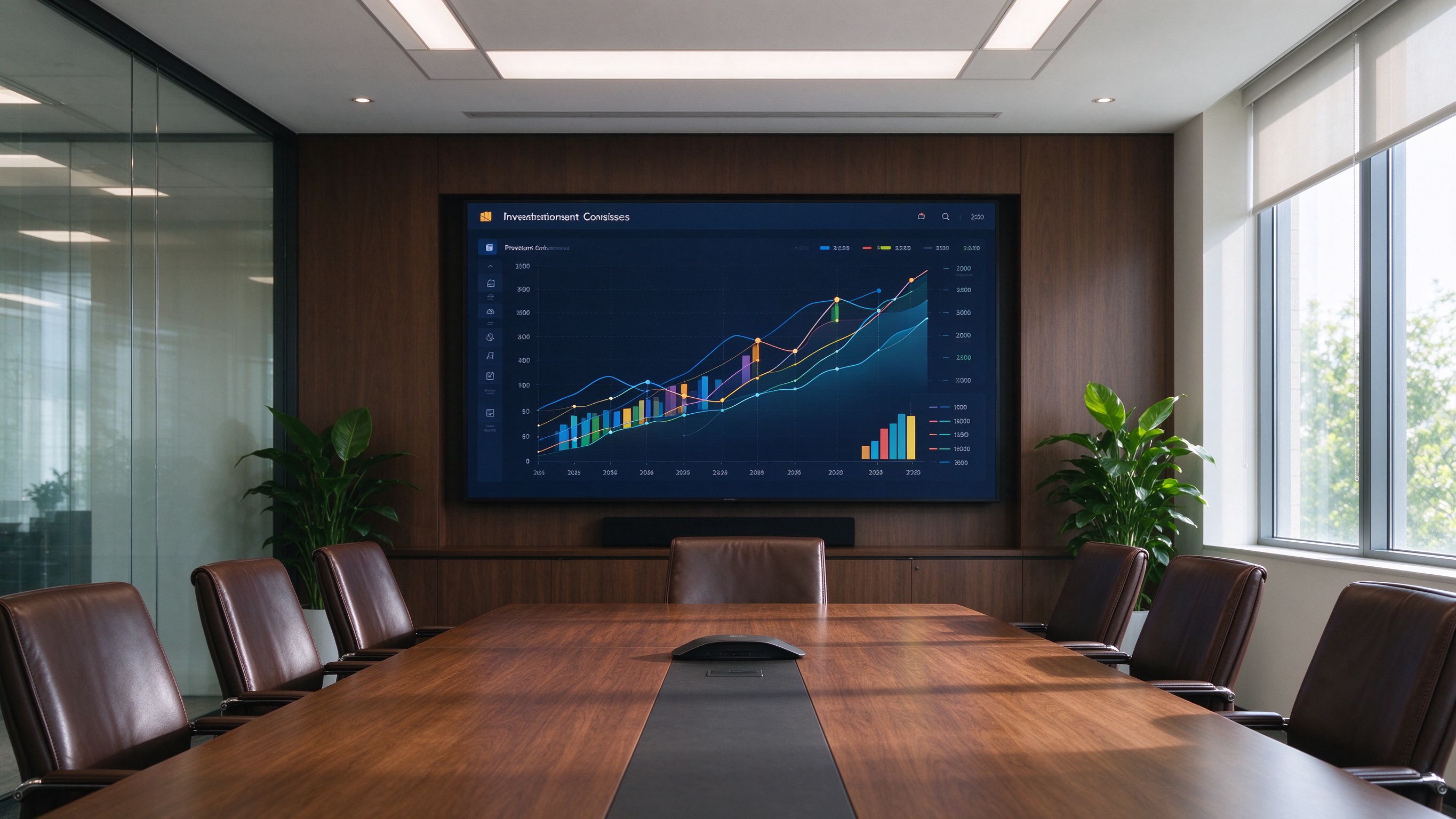
We first sat through two committee meetings to watch what the committee actually asked. It turned out they looked at a small set of things each week: portfolio performance vs benchmark, Australian equity sector moves, AUD vs major crosses, yield-curve slope, and a short list of macro releases due that week. Forty terminal panels were not being read — five recurring questions were.
We built a single internal dashboard with exactly those five panels, sourced from the cleaned datasets we had already put in place. The dashboard refreshes automatically each Monday morning, with a change note listing anything that moved since the prior week. We also produced a short "panel notes" file so that if a committee member asks why a number looks different, the analyst can point to the source rather than re-running the spreadsheet.
The Monday preparation task dropped from a full day of analyst time to zero manual work. The committee started asking sharper questions because the panel was consistent week to week. Most importantly, the "where did this number come from" question now has a one-line answer. We did not try to automate the committee's judgement — we removed the mechanical work between them and the market data they already wanted to see.